

 Recommended
Biogas
Machinery breakdown, loss of income and operator liability for your plant.
- Machinery breakdown
- Loss of income
Overview
All insurance products at a glance, with a recommendation for your farm.
All insurance productsVersion 1.1 · November 2026
Digital farm insurance. All the foundations and components of this website, explained piece by piece.
Foundations
Six colours, no others. Greens drawn from agriculture form the foundation, Weiß and Weißgrau bring calm, Gelbgrün adds accents. Click a colour to copy its hex value.
Do
Don't
Dark text on light surfaces, light text on dark surfaces. Gelbgrün only on Dunkelgrün or Schwarzgrün. All allowed pairs achieve a contrast of at least 4.5 : 1 (WCAG AA).
One family, two weights: Geist Extra Bold for headlines, Geist Medium for body text. Hierarchy comes from the ratio 4x : 2x : 1x. Letter spacing always stays at 0.
.t-headlineFarming - protected.
.t-headline-sDigital farm insurance.
.t-sublineAgricultural insurance for your farm.
.t-leadManage your farm insurance easily online.
.t-bodyFARMRISK makes it easy for you to find the right cover: with clear information, plainly explained benefits and direct online purchase.
.t-smallTyre insurance covers repair or replacement after cuts, punctures and vandalism.
.t-metaDo
Don't
The logo (word and brand mark) combines the brand mark and the lettering. The brand mark shows an ear of grain and the double track left by machinery in the field. Its two arcs, f and r, curve protectively like a roof. Only the original files in assets/logo/ may be used.








Do
Don't
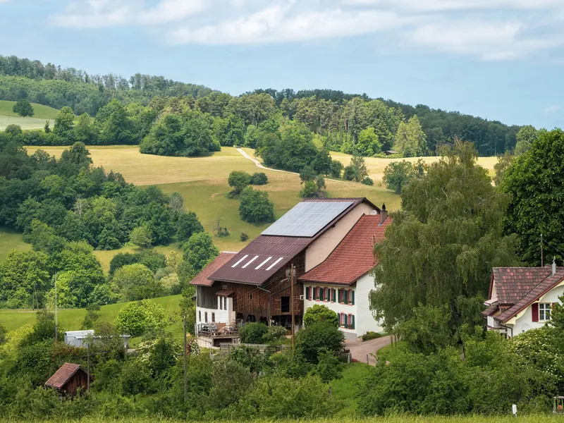
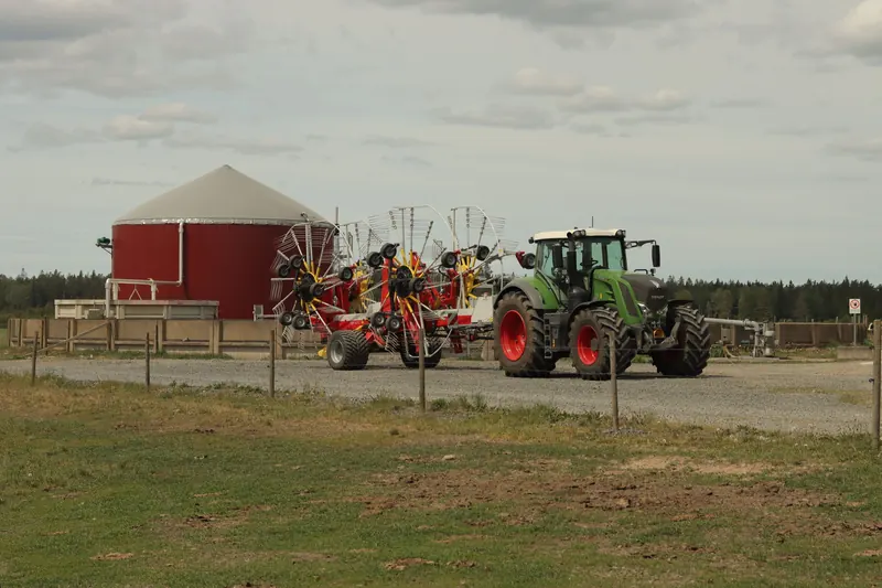
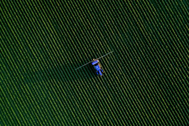
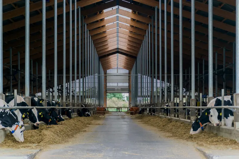
Generous, authentic photography with clear compositions and wide perspectives: modern, high-quality, inviting. Calm and documentary, with natural light.
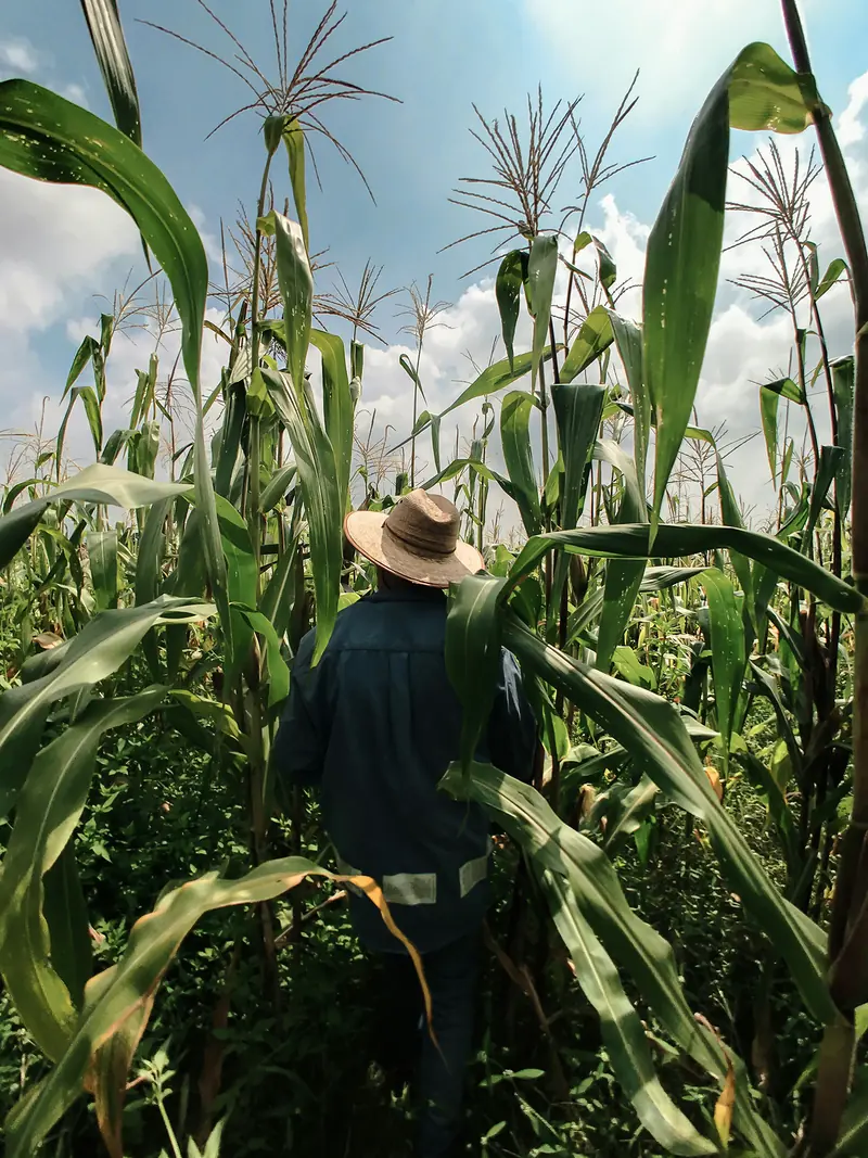
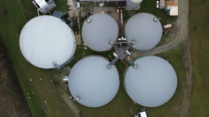
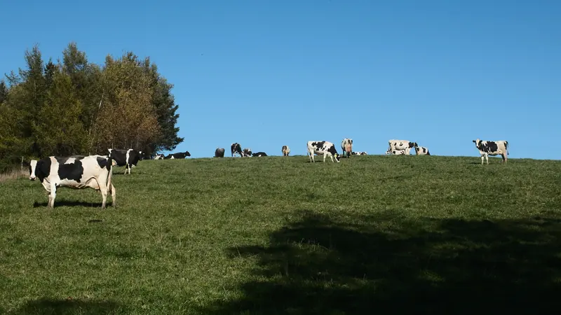
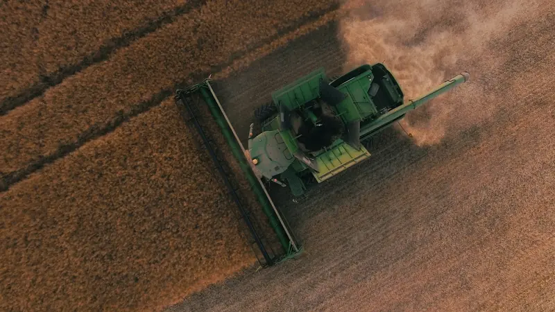
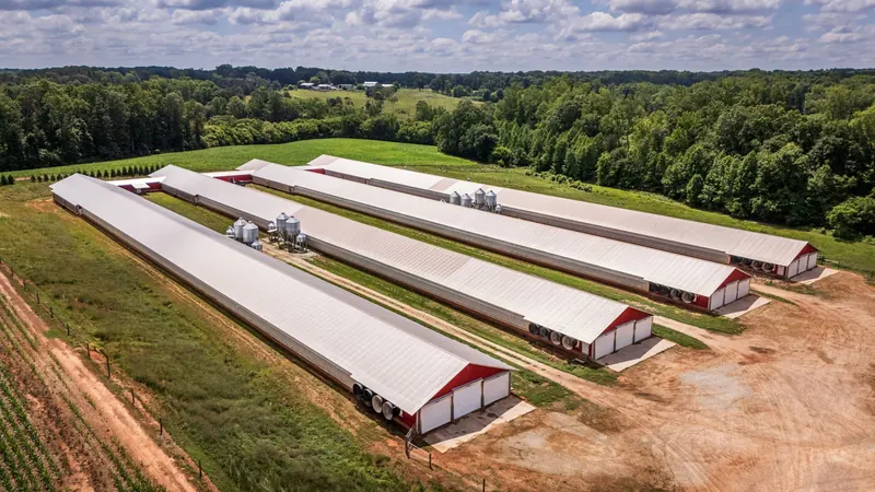
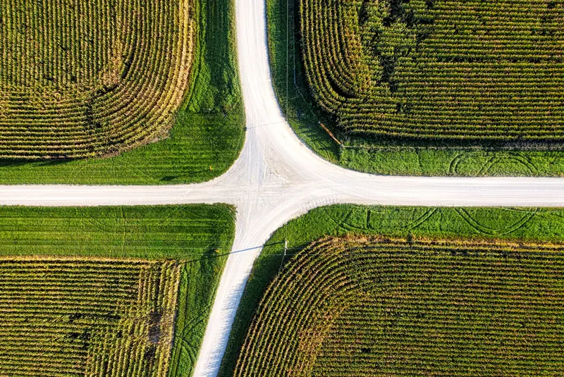
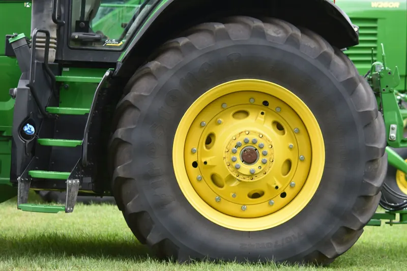
Do
Don't
The brand book does not define spacing or radii; these values come from the website and follow the brand-in-use designs: rounded image frames, pill buttons, plenty of white space.
--s-1 4--s-2 8--s-3 12--s-4 16--s-5 24--s-6 32--s-7 48--s-8 64--s-9 96--s-10 128--radius-xs 8--radius-sm 14--radius 20--radius-lg 20–32--pill 999--gutter 12–32 px--section 72–144 px vertical| Class | Purpose |
|---|---|
.container | Content width: at most 1440 px, with side margin. |
.section | Section with full spacing above and below (--section). |
.section--tight | Shorter spacing for bands such as the CTA band and steps block. |
.section--grau | Section on white-grey, full width. |
.section-gap | Space above a band without a section of its own, such as the marquee. |
.block | Colour field with side margin and large radius: CTA band, steps block, brand moment. |
.stack · .stack-sm | Elements stacked, 24 or 12 px apart. |
.row | Elements side by side with wrapping, e.g. two buttons. |
.sr-only | Screen readers only, e.g. status messages from filters. |
.is-in | State: the script has revealed the element on scroll. |
Motion guides, it does not decorate: content glides calmly into view on scroll, headlines build word by word, images open like a frame. With “Reduce motion” enabled in the system settings, all of it is switched off.
cubic-bezier(.22, 1, .36, 1)Fade-ins, hover, revealscubic-bezier(.65, 0, .35, 1)Masks, menu, accordioncubic-bezier(.34, 1.56, .64, 1)Arrows, ticks, small confirmationsdata-revealfade, scale, maskdata-splitdata-staggerdata-scrub-wordsdata-parallaxdata-mark-fillThe FARMRISK icon set: tractor, cow and flame by max & doris (November 2026), plus shield with §, round bale and farmstead with silo in the same style. The website uses Route 02 in line style, because it matches the arrow and the checkmarks. Route 01 in solid style is the alternative from the same presentation. Alongside them are the arrow, the brand mark (as page marker, as separator in the ticker and as progress in the steps block) and the double track as a graphic motif.
Sizes: 20 px in controls, 24 px next to text, 36–44 px on tiles. All icons sit on a 24-unit grid with a 2-unit margin and share one baseline.
Colour: Dark green on light surfaces, yellow-green on dark green.
Route 01, solid: alternative, not used on the website; the shield, the round bale and the farmstead exist only in line style. SVG: Tractor, Cow, Flame.
Do
aria-hidden); the label carries the meaning.<use href="../assets/icons/farmrisk-icons.svg#cow">.Don't
Components
Pill shape with an arrow in a circle, as in the brand book. On hover the circle grows to fill the button and a fine 1px outline appears, the same for all variants. Labels start with a verb.
Primary (Weiß) on photos and dark surfaces. The original from the hero.
Dark, ghost, small, text on Weiß, Weißgrau and Hellgrün.
Accent (Gelbgrün) only on Dunkelgrün or Schwarzgrün.
Round arrow button and text link. On hover the arrow turns from ↗ to →.
Aerial photo in a rounded frame (.hero with .hero__frame). The headline sits bottom left in white, the white pill button bottom right (.hero__cta, fades in after loading). On load the image zooms in gently and the headline builds up; on scroll the frame recedes slightly. On the homepage the hero fills the screen and shows the scroll cue at the bottom centre; sub-pages use .hero--page with less height.
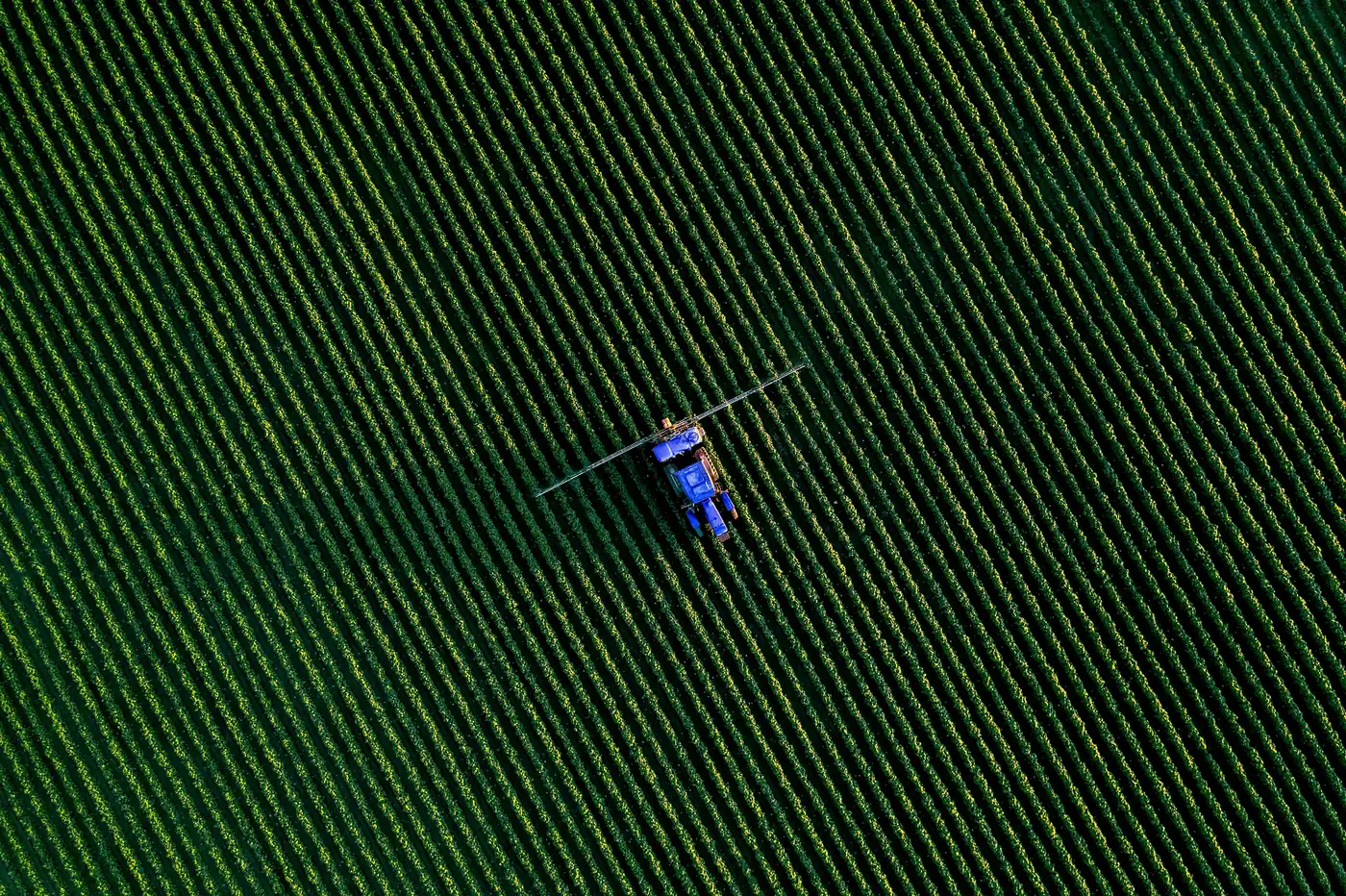
Digital farm insurance.
Farming -
protected.
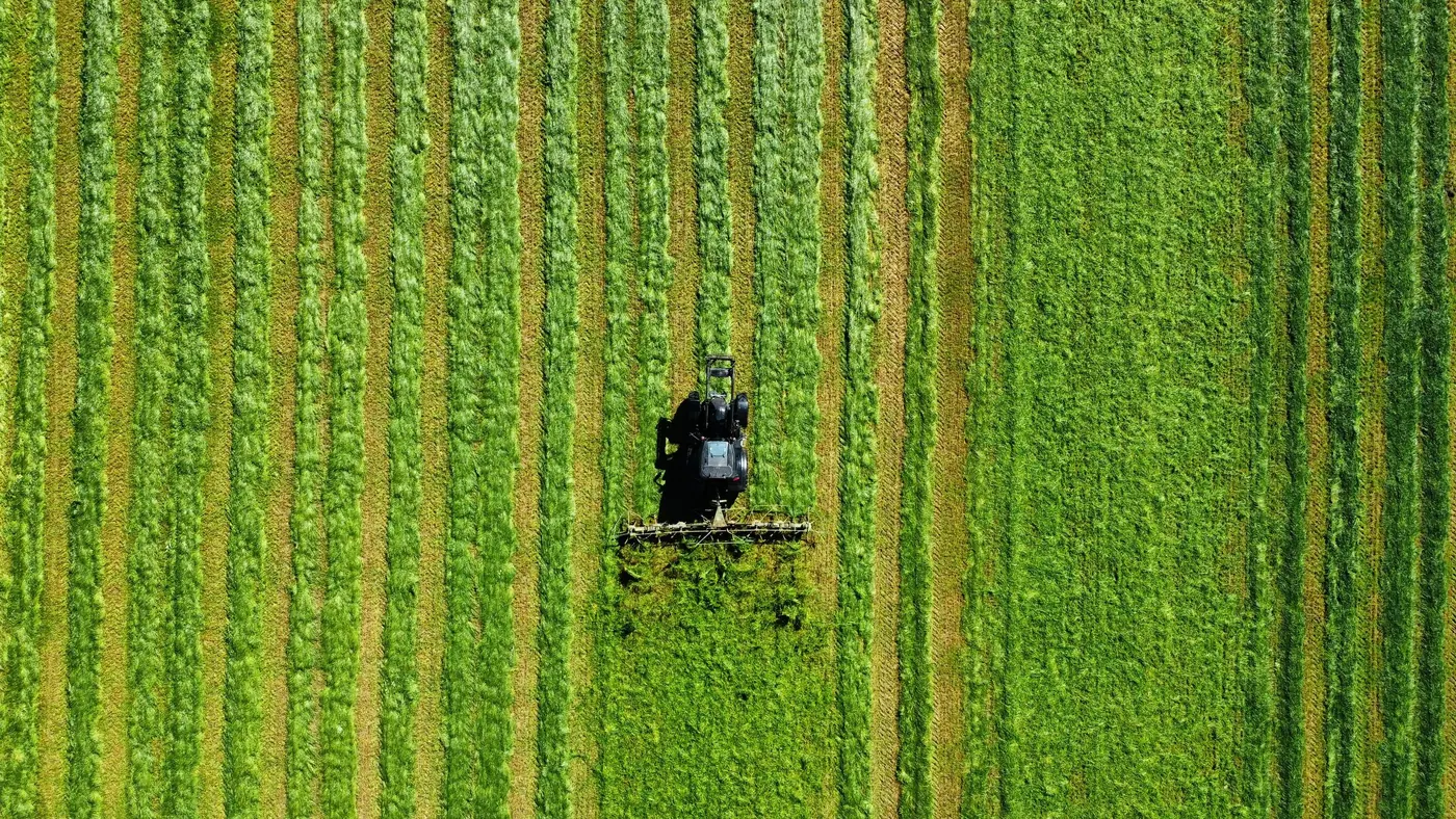
Machinery -
protected.
Sub-page. From the second level, the breadcrumbs (C-17) replace the kicker. Area pages adapt the claim: ‘Area - protected.’
Page header without a photo (.page-head) for pages that get straight to the point, such as Contact and Guides: eyebrow and headline on the left, introduction on the right, aligned at the bottom.
The eyebrow label with the brand mark places sections in context and sits directly above what it names. The statement is set large (Headline S size in Geist Medium, keywords in Extra Bold) on the same left edge as the headlines; its words become visible one after another on scroll. Supporting text and link sit in the right half from column 7. As a section of its own it sits in .statement, which sets the spacing above and below.
Do
Don't
Section intro. Label and headline in columns 1–6, supporting text or link from column 7, aligned at the bottom.
Colour fields in light green, yellow-green, white-grey and dark green with the name at the bottom left, as in the brand book. Each of the seven insurance areas has a fixed colour and a fixed position. An icon sits at the top right when the set has a fitting motif. On hover the short description and the arrow appear, and the arrow takes the icon's place. On its own area page the tile carries the ‘You are here’ badge.
States. ‘Management’ as the current page with the ‘You are here’ badge.
Area grid. The seven areas in a fixed order plus one tile per page (overview, finder or calculator), 4 × 2, on phones 2 × 4. Neighbouring tiles never share a colour. The fire layer has no icon because the set has no motif for it yet.
7 areas. One digital route.From the cowshed to the biogas plant: compare and take out cover online.
MachineryTractors, machinery and tyres.You are here
Renewable energyBiogas and solar PV.You are here
ManagementD&O, legal expenses and cyber.You are here
FarmLiability, buildings and loss of income.You are here
Livestock yield lossFor cattle, pigs and poultry.You are here
Crops & goodsStores in the barn and in the field.You are here
Fire layerExtra fire cover for high values.You are here
Homepage. The photo tile first (2 × 2), then the seven areas; the last tile is double width so the grid comes out even.
Do
Don't
Weißgrau card with a photo, product name and a one-line description. The round arrow button sits top right in a Weißgrau circle that cuts a rounded notch out of the photo corner. The card edge stays straight. Two cards form a staggered pair on the 12-column grid (.pcards): the first in columns 1–5, the second lower in columns 7–11.
For the insurance overview: area, name, description, insured risks as chips, ‘Learn more’ to the product section (C-24) and ‘Get a quote’. If a product matches the ‘What suits my farm?’ selection, it gets a frame and badge. Where no fitting photo exists, a colour field with the double track takes its place.
RecommendedBiogas
Machinery breakdown, loss of income and operator liability for your plant.
RecommendedBiogas
“Recommended” state: border in Dunkelgrün, badge visible.
Finder above the product grid (.prods, 3 columns): question on the left, farm type selection (C-09) and status line on the right. Matching cards move to the front and get a frame and badge.
Advice card (.prod--cta) at the end of the product grid: dark, with a yellow-green button.
Without a photo: Colour field with the double track in four fixed pairs (mark--dunkel, --hell, --gelb, --schwarz), the same as in the example panel of the product section.
Chips label categories, risks and filters, or work as jump links to sections of the page. Badges mark states such as ‘New’, ‘Coming soon’, ‘Recommended’ or ‘You are here’.
Filter chips with aria-pressed, active in Dunkelgrün.
Jump links: Outline chips in the statement of an area page that lead to the product sections. Only with two or more sections.
For audience tabs, the product recommendation and scenarios. The dark marker slides to the selected option. Works with the arrow keys. Options can carry an icon before the label, like the farm types in the finder.
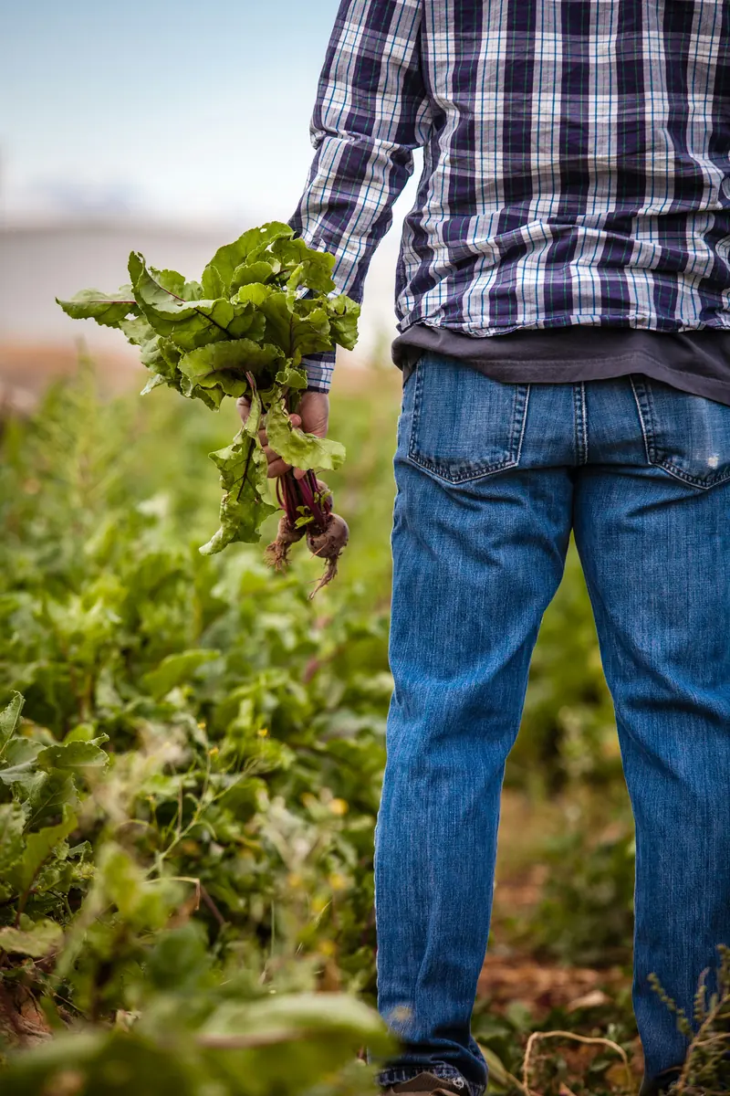
For your own farm.
You know your farm best. FARMRISK shows you which cover suits it, and you take it out directly online.
Audience panel (.audience__panel) below the tabs: photo in columns 1–6, text from column 7. On switching, the photo slides in from the right and the text rises one line after another.
For FAQs. Based on <details>, opens with a smooth height animation; the plus turns into a minus. In the FAQ section, label, headline and contact button sit on the left, the questions on the right. On white-grey the circles turn white.
An additional tier of cover above the base insurance.
On white-grey, as in the FAQ of the area pages.
FAQ section (.faq__grid): label, headline, note and contact button on the left, the questions on the right.
Weißgrau fields with the label above. On focus they turn white with a Dunkelgrün border. Errors show a stronger border and a message with an exclamation mark; the palette deliberately contains no red.
Form: .form stacks the fields, .form__row puts two side by side (stacked on phones). Optional fields carry ‘(optional)’ in the label; required fields have no marker.
Choice cards for radio and checkbox groups in the calculator.
Grouped: In long lists, area labels order the cards, like the insurance products in the calculator.
Shows where you are in the calculator: completed in Hellgrün, current in Gelbgrün. The progress bar is also used as reading progress in articles.
Large number in headline size that counts up when it appears, with a short explanation below.
Product names run endlessly, separated by the brand mark in the text colour. On scroll the band briefly speeds up. Gelbgrün as the surface with Dunkelgrün text.
Teasers for the guide: published articles in Dunkelgrün, planned topics in Weißgrau with the “Coming soon” badge.
Feature card (.acard--feature) for the latest article, on white-grey across the full width of the grid (.acards). Without a photo it carries the PV illustration: modules in light green and yellow-green on dark green that build up one after another as it appears.
The info box highlights tips, light or dark; with a button (.ask) it becomes a prompt, e.g. ‘Missing a topic?’ in the guides. The tick list lists benefits. The checklist lets readers check their own policy, remembers their progress in the browser, can be reset and gives praise when everything is ticked (.checklist__done).
Tick list for benefits, e.g. ‘Cover includes’ in the product section (C-24). On dark grounds the circle turns yellow-green.
Breadcrumbs only appear from the second level, where they replace the eyebrow line above the headline, or the kicker in a photo hero. On first-level pages they are omitted, because the navigation marks the current page. “Home” is left out; the logo leads to the homepage. On phones the path becomes “← parent page”. The table of contents in the article stays at the side and marks the current section; below 1000 px it is dropped and the progress bar at the top shows the position.
Photovoltaik insurance for farmers.
Two levels. The path takes the place of the eyebrow line, flush with the headline.
Three levels. Parent levels are links; the current page appears as text at the end.
Phone. Below 640 px the path only shows the parent page with a back arrow.
Do
Don't
For comparisons. Header row in Dunkelgrün, rows alternating Weiß and Weißgrau. Scrolls sideways on small screens.
Closes almost every page: Hellgrün surface, a statement with an emphasised keyword, two buttons and a large Schwarzgrün brand mark that stands with its base on the bottom edge and rises once when it appears. On the page it sits as a .block inside a .section--tight; the text can change per page, e.g. ‘Become a FARMRISK partner.’ for intermediaries.
For guided flows such as the quote calculator: on the left the dark panel with title, steps, selection and brand mark, on the right the current step. On desktop everything fits on one screen. The button bar is fixed at the bottom, level with the bottom edge of the panel, and sits in the same place on every step. If there is not enough space, only the step content scrolls. On the page the frame is .calc.
Scaled-down preview. If nothing is chosen yet, a note appears under ‘Your selection’ (.calc__empty). View live
Extra questions and errors. An outlined block (.calc__cond) only appears when the chosen product needs it. If a selection is missing, the message appears below the cards.
Completion. White-grey field with the brand mark, a thank-you and a summary of the details (.calc__summary).
Do
Don't
Explains a process in steps. Steps on the left; headline, text and button on the right. In the bottom right corner the brand mark stands on the edge: set in Schwarzgrün, it fills from the bottom in Gelbgrün on scroll, in equal parts per step reached (one third each with three steps). The line above a step turns Hellgrün as soon as it is reached; scrolling back empties everything again. Outline chips below each step can name the key points (.step__tags).
Live: Scroll slowly through the preview. The brand mark fills with every step reached.
Do
Don't
Switches between German and English and always leads to the same page in the other language. Two abbreviations in one pill, with the current language filled, as in the segmented control. On desktop it sits in the navigation bar before the button; on phones it sits in the menu.
Light: in the navigation bar.
Dark: in the menu on phones.
Do
lang and hreflang and give the group a label.Don't
Presents one insurance product on its area page: number, name, short description, ‘Cover includes’ as a tick list (C-16), ‘Get a quote’ and ‘Request advice’. Next to it is a photo or, where no fitting motif exists, a real-life example on a colour field with the double track. On the 12-column grid the text starts at column 7; every second section is mirrored, with the text in columns 1–5. A hairline separates the sections; all sections of a page sit together in .psecs. On phones the image sits above the text.
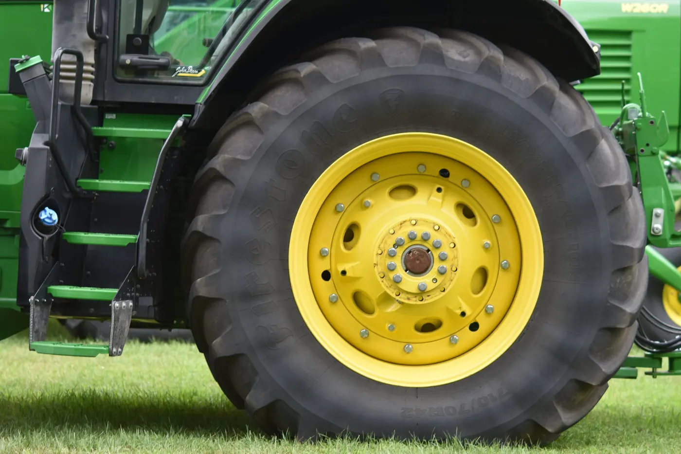
Tyres
Tyres for tractors and harvesters are expensive and easily damaged.
With a photo. Image in columns 1–6 with space to the text, aspect ratio 5 : 4.
Mirrored, with example panel. Four colour pairs: dark green with yellow-green, light green with dark green, yellow-green with dark green, black-green with light green. The double track grows from the bottom right corner.
Do
id) for the products menu and jump links.Don't
Three white cards on white-grey with number, title and short text, for reasons and benefits: ‘Why FARMRISK’ on the overview, ‘Your benefits’ for intermediaries. They appear one after another.
Complex insurance topics, explained simply.
Honest, direct and on an equal footing.
Transparent benefits and a straightforward process.
Do
Don't
An aerial photo across the full width with a large yellow-green brand mark in the centre and the brand line at the bottom left. For a calm moment between two content sections on the homepage. On scroll the photo moves more slowly than the page, and the brand mark grows to full size with a slight turn.
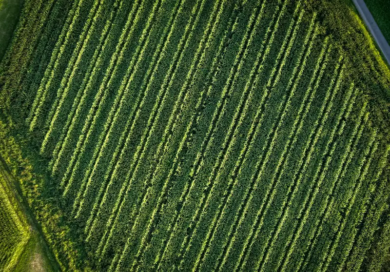
Digital farm insurance.
Modern, digital and close to farming. So you can focus on your farm.
Do
Don't
Ways to get in touch as cards (.ccard) next to the form (.contact). White-grey cards for phone and email, dark green for ‘Report a claim’, light green for intermediaries. Clicking a card with a topic preselects that topic in the form. After sending, a confirmation replaces the form.
Contact cards. Icon in a circle, type in capitals, value in bold, note in small text. On hover they lift slightly.
Form block with a fine outline and large radius; on the right, the confirmation after sending.
Do
Don't
Portrait photo on the left; on the right a label, headline and a longer text with key words in Extra Bold. For introducing FARMRISK (‘About FARMRISK’). The photo opens from the centre as it appears.
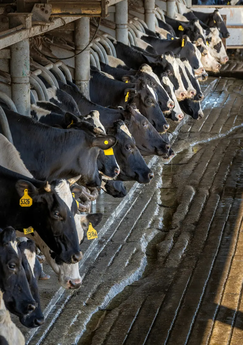
About FARMRISK
FARMRISK makes finding the right cover simple.
Do
Don't
Structure of a guide article: at the top, a reading progress bar across the full width (.readbar, light green), then the head with breadcrumbs (C-17), the topic as a chip, the headline on the left and the introduction with author line on the right. Below it a wide title image. The text sits on the 12-column grid: table of contents in columns 1–3, text in columns 5–11 with a limited line length. At the end come sources and a note about advice. The whole article sits in .article.
Head (.article-head) with the author line (.article-meta): brand mark as avatar, editorial team, date and reading time, ‘Copy link’ on the right.
Title image (.article-hero) in 21 : 9, on phones 4 : 3, with a large radius.
Text (.prose): subheadings in subline size, paragraphs at most 66 characters wide, emphasis in Extra Bold. At the bottom, sources and a note (.article-foot) above a hairline.
Do
Don't
Modules that structure an article: ‘Key points at a glance’ at the start, numbered facts with a source, an explanatory graphic with a toggle, numbered building blocks, an article CTA and related tiles at the end. Info box, checklist (C-16), table (C-18) and accordion (C-10) complete the set.
Summary (.summary) on white-grey with a tick list.
Ranking (.damage): the first item dark across the full width, the rest in pairs. The source goes directly below (.source).
Explanatory graphic (.surge): dark field with a diagram in the brand colours and a segmented control to switch between two states. The caption explains the chosen state. Try ‘With cover’.
Building blocks (.modules): numbered outline cards, the number in a light green circle.
Article CTA (.article-cta) after the conclusion: dark field, product as eyebrow, yellow-green button.
Related (.related): three tiles (C-05) for the insurance products the article is about.
Do
Don't